

FinGraphs' 4 unique and proprietary Indicators
FinGraphs offers a series of unique and proprietary indicators that will help you in your investment decisions. By browsing through our indicators overviews you may find valuable additions to your investing experience.
FinGraphs Focuses on the Essentials
FinGraphs is not a toolbox of dozens of indicators that you need to learn to use and parameter. FinGraphs focuses on the Essentials of any Financial market decision making process: identifying the prospective Market Direction and assessing the related Risk/Reward situation.

1. Automated Trend Interpretation
FinGraphs calculates two standard deviation envelopes around price (larger yellow and thinner white envelope). Their slopes help FinGraphs assess the potential Trend Direction. A potential uptrend is illustrated by a BULL "THINK POSITIVE" and a potential downtrend by a BEAR "THINK SAFETY".

Trends in 3D
FinGraphs presents "Markets in 3D", i.e. each chart is presented over 3 investment/trading horizons
1. Primary trend: Longer Term 2. Secondary trend: Medium term 3. Minor Trend: Sorter Term.

The trend analysis is then summarized in a 3D Market Positioning box. This Robo-Advisor takes into account the BULL and BEAR potential Trend identifications over the 3 time frames. These are then combined to generate a 3D Markets Positioning message.

The trend analysis is then summarized in a 3D Market Positioning box. This Robo-Advisor takes into account the BULL and BEAR potential Trend identifications over the 3 time frames. These are then combined to generate a 3D Markets Positioning message.
There are 3 time-frames which can either be in BULL or BEAR, resulting in 8 combinations :
4 Potential Uptrend & 4 Potential Downtrend
1. Continuous Uptrend

All three trends - primary, secondary and minor are in a potential Uptrend.
1. Continuous Downtrend

All three trends - primary, secondary and minor are in a potential Downtrend.
2. Potential Intermediate Top

The short term trend, minor, is in a potential Downtrend "Bear" while the primary and secondary trends are still in potential Uptrends.
2. Potential Intermediate Bottom

The short term trend, minor, is in a potential Downtrend Uptrend "Bull" while the primary and secondary trends are still in potential Downtrends.
3. Potential Consolidation in an Uptrend
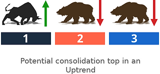
The short term trend, minor, and the secondary trend are in potential Downtrends "Bear" while the primary
trend is still in a potential Uptrend.
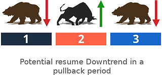
3. Potential Pullback in a Downtrend

The short term trend, minor, and the secondary trend are in potential Uptrends "Bull" while the primary trend is still in a potential Downtrend.
4. Potential Resume Uptrend

Following a consolidation period, the short term trend,minor is back in a potential Uptrend "Bull".
4. Potential Resume Downtrend
Following a strong pullback, the short term trend, minoris back in a potential Downtrend "Bear".
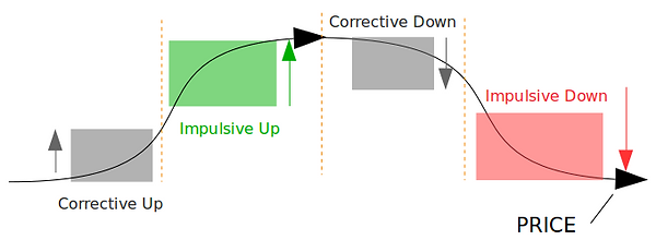
2. Potential Price Target Zones
FinGraphs automatically calculates possible Price Target Zones. These are intended to match the price potential with the possible time period for its completion, resulting in up or down price beams. FinGraphs differentiates between 4 types of possible Price Target Zones.

Corrective UP
early Uptrends
Corrective DOWN
early Downtrends
Impulsive UP confirmed Uptrends

Impulsive DOWN
confirmed Downtrends
When most new potential trends usually start gradually as a correction up or down ("C up", "C down"), only a minority of these are strong enough to make it beyond their possible corrective targets zone into impulsive territory ("I up", "I down"). When it happens, these potential trends are then confirmed and considered to be more robust. Once possible impulsive targets zones have been achieved, prices will usually enter a consolidation period.
Ideal Model
In an ideal swing trading world, where all Corrections turn into potential Impulsive trends and potential trends start to reverse once they have reached their possible Impulsive targets zones (no Impulsive 2 trends), the theoretical model could be pictured as follows.
How Are FinGraphs' Targets Calculated ?
Target ranges are calculated using a measure of volatility called "delta". "Delta" is defined as being the width of FinGraphs' larger envelope.

Amplitude: FinGraphs differentiates between corrective and impulsive targets.
Depending on the direction and the maturity of the trend, potential price target zones are calculated by multiplying "delta" by either a corrective factor (0.5x to 0.8 times "delta") or an impulsive factor (1.3 to 1.7 times "delta") and then subtracting /adding these results from/to the most relevant top or bottom of the chart (see examples below).
This methodology implies that statistically most market moves (corrective or impulsive) usually find exhaustion in one of these two “factors of delta” zones (in the corrective zone for counter trend moves, in the impulsive zone for stronger trends).
Hence, once a price move makes it over or under the corrective targets (+/- 0.8 times “delta”), it then turns "impulsive" and has a strong chance of achieving impulsive targets (+/- 1.3 to 1.7 times “delta”). Many years of observation as well as extensive statistical tests have been performed over the years to best assess the factors. They have now been applied for more than 20 years by Management Joint Trust SA.
Uptrend Price Targets
Corrective Up


Impulsive Up

Downtrend Price Targets
Corrective Down

Impulsive Down


Impulsive "2" Targets
In some rare cases, potential trends may continue to accelerate and overun impulsive targets to above 2X ∆ (very strong moves). FinGraphs then calculates a super Impulsive target zone called Impulsive 2 Up or Down.
"I2 Up or Down" (+/- 2.3 to 2.7 times ∆ "delta")
FinGraphs does not calculate possible impulsive 3 targets zones as their occurrence would be extremely rare.
Impulsive 2 UP
extended Uptrends

Impulsive 2 DOWN
extended Downtrends
Targets Done
Once the possible price target zone has been achieved or exceeded or that its timing has been overrun, targets can then be labeled has being DONE (e.g. "C up done", "I down done", "I2 up done"). Such situations imply that the potential trends which is being measured may be exhausted and that the market is now looking for direction or further confirmations.
Let’s look at 2 examples and their possible interpretations:
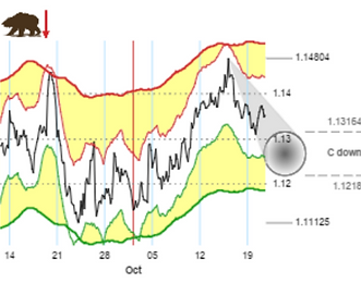
C up Done
prices have recently reached the possible corrective target zone up and are now beyond the timing usually allocated for such a correction (targets "done"). The market is now waiting to confirm a break-out above the upper boundary of these corrective targets (into Impulsive up territory), or alternatively to resume the downtrend, now that the correction up has been completed.

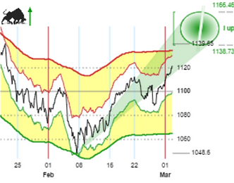
I down Done
prices have reached impulsive tragets down both in terms of possible price targets and timing ("I down Done"). Although, a reversal cannot be confirmed yet, the move down is possibly exhausted. Over the next few period, it may turn up into a Corrective Up move or may extend into an Impulsive 2 down move (fairly rare)

No Targets
FinGraphs only displays its possible targets price "beams" when they are in accordance with the potential trend (BULL and BEAR indications). In some occasions, this is not the case. FinGraphs, then elects not to display any price beams. In such cases, the Potential Trend is considered to be in danger, very weak or, more generally, pretty much "NEUTRAL".
This usually happens when a potential counter-trend move is very rapid (impact of news, high volatility). In such cases, the Targets algorithm, which is based on pure prices movements, will react quicker that the potential trend analysis, which is usually slower to turn (yet more robust). The targets will then momentarily disappear, while the two algorithms resynch, either confirming a new potential trend or reinstating the previous one.


In such cases, users should consider the neighboring frequencies for guidance, either focusing OUT to take a longer term view, or focusing IN to monitor the situation on a shorter term basis.
Timing for Targets Completion
FinGraphs possible price target projection "beams" are meant to square possible price target zones with the expected timing for their completion. This squaring process determines the slope and reach of FinGraphs possible price projection "beams".
The beams end with an ellipse representing the probable Timing for completing the price Targets. When the entire ellipse has moved into the chart, the probable time left to complete the targets is limited.

When Possible Target Timing Extends Beyond the Scope of the Chart
The possible timing for targets completion may extend beyond the scope of the chart. In such cases, FinGraphs targets "beams" or possible target zones may be fractionned to show this continuity.
Uptrend & Downtrend examples:

Although, prices have almost reached the edge of the possible target zone in terms of timing, this possible target zone may extend beyond the scope of the chart.:

Timing to reach this possible target zone as well as the length of this possible target zone are both expected the extend beyond the scope of the chart.
3. Potential Price Exaggeration
Market Stress or Price Exaageration is defined when the smaller white envelope comes into contact with the larger yellow one. This means that the shorter term price evolution has gone too quickly in respect to the pace of the longer term trend. Hence, these contact points represent exaggerations of price and a reaction in the opposite direction is possible.

Indeed, when both Envelopes collide. Prices then have a strong probability of consolidating, correcting or possibly changing direction (forthcoming consolidation, correction or reversal). This could be a STOP Sign for one of your selected strategies. It may not terminate the entire move, but does potentially constitute a halt signal in the trend.
WARNING
To avoid acting too early, a Market Stress is usually confirmed once the smaller envelope has turned or has re-entered the larger envelope.

The likelihood of a strong correction or a potential reversal is increased when the Trend ( determined by the Bigger Yellow Enveloppe Bear or Bull) has already started to weekened (flattening channel). This is especially true following several previous stress points.
4. FinGraphs' Risk Indicator
In order to evaluate if an instrument is historically cheap or expensive versus its recent past, FinGraphs calculates a risk indicator which swings between two boundaries :
. Red - Overbought (historically expensive) vs recent past
. Green - Oversold (historically cheap) vs recent past
A potential trend reversal is possible when this indicator leaves one of the boundaries, after having penetrated it.

Indeed, FinGraphs' proprietary Risk index is the FinGraphs' version of a Momentum indicator/oscillator. It is meant to identify when accelerations in the price have gotten ahead of themselves and should start to loose momentum, i.e. when the price (in respect to its recent past) is becoming OVERBOUGHT or OVERSOLD. In such circumstances, price moves usually come to exhaustion and a correction or a reversal can probably be expected.
As shown above, these OVERBOUGHT or OVERSOLD conditions are signaled when our Risk Index enters respectively the Red and Green zones on the bottom scale of our FinGraphs' charts.
WARNING
However, in order to call an exhaustion or reversal , the Oscillator "risk Index" must confirm its top/bottom by finally moving out of the OVERBOUGHT or OVERSOLD zone.

Risk Indicator Tactics
The FinGraphs’ methodology favors trend following as a strategy. FinGraphs' Risk Indicator can however deliver worthwhile indications as to the exhaustion and weakening of those trends and with them interesting opportunities to take profit within or exit a trend.
Ideally when identifying an exhaustion, an exaggeration of the Risk Index would want to be confirmed by a Price Exaggeration (both FinGraphs’ envelopes touching each other) and possible price target zones which have been met:

Risk Indicator Tactics
A Risk Indicator making lower tops in a uptrend or higher bottoms in a downtrends can also be a sign of a weakening trend, especially if prices have continued up or down (i.e. if there is a divergence between the price and the Risk Indicator).
